
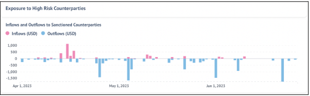
Inflow and Outflow to Sanctioned Counterparties
The Analytics section displays the inflows and outflows of funds to and from the addresses belonging to the VASP to and from the Sanctioned Counterparties over the selected period of time and selected chains. The inflows are depicted in pink, while the outflows are depicted in blue. The X-axis presents the selected time period, and the Y-axis depicts the cumulative funds in USD that have moved on a particular date.
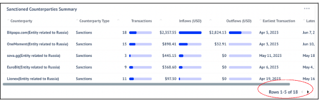
The table beneath shows the sanctioned counterparties that have interacted with the selected VASP. Here, the table shows essential details such as the counterparty's name, type, the number of transactions with the selected VASP, amount of inflow and outflow in USD as well as the latest transaction date and the first transaction date with the selected VASP.
Note that the transaction dates are specific to the selected VASP.
Currently the table only shows the top 5 rows. To see more users select the arrow button on the bottom-right corner of the graph highlighted by a red circle below.
Updated about 1 year ago